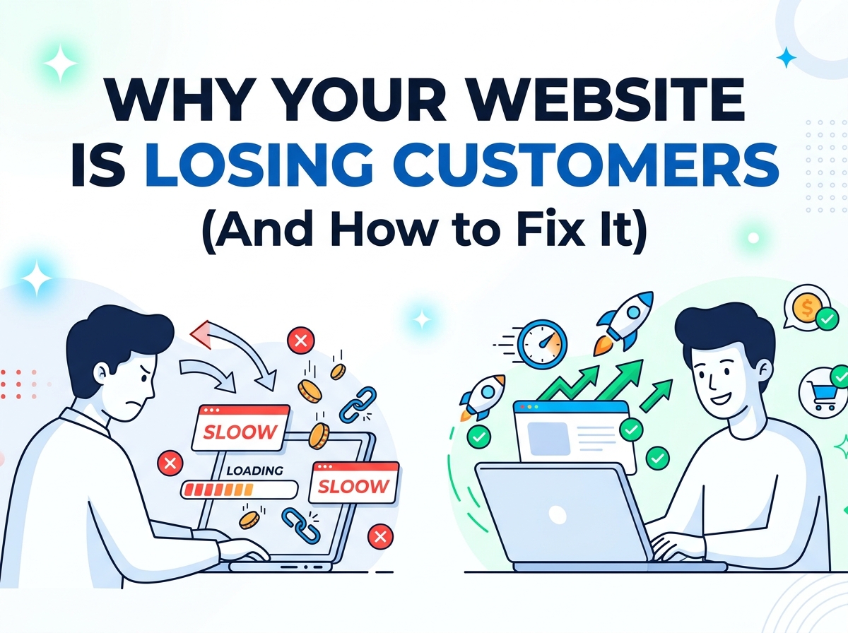
You spent time building your website. Maybe you even paid someone to design it. It looks decent, it is live, and you are driving traffic to it — yet the leads are not coming in. The phone is not ringing. The inquiry form stays empty.
Here is the hard truth: your website might be the reason you are losing customers before they ever get a chance to know you.
This is not rare. According to a 2025 report by Conviva based on data from 37 million consumers, 91% of consumers encountered a frustrating digital experience in the past year — and 50% of them switched to a competitor as a direct result. That is half your potential customers walking straight into the arms of your competition because of a poor website experience.
The good news? Every single one of these problems is fixable. Let us break them down.
1. Your Website Takes Too Long to Load
This is the number one silent killer of conversions.
Research shows that 53% of visitors abandon a mobile page that takes longer than 3 seconds to load. As load time increases from just 1 to 3 seconds, the probability of a visitor bouncing increases by 32%. Even more alarming — a 1-second delay in mobile load time can cut your conversions by 20%.
Visitors do not wait. They click the back button and find your competitor who loads faster.
How to fix it:
- Compress and optimize your images (use WebP format instead of PNG or JPEG)
- Remove unnecessary plugins and third-party scripts
- Use a Content Delivery Network (CDN)
- Enable browser caching
- Run your site through Google PageSpeed Insights and fix every issue it flags
If your site scores below 80 on PageSpeed, you have a problem worth solving today.
2. Your Homepage Does Not Clearly Explain What You Do
You have less than 8 seconds to convince a visitor they are in the right place. Most websites fail this test completely.
If your headline reads something like “We deliver innovative solutions for your digital journey” — you have said absolutely nothing. Visitors land on your homepage and immediately ask themselves three questions:
- What does this business do?
- Can it help me?
- What should I do next?
If your homepage does not answer all three within seconds, they are gone.
How to fix it:
Rewrite your headline to be specific and outcome-focused. Compare these two examples:
- Weak: “Creative web solutions for modern businesses”
- Strong: “We design high-converting websites for small businesses that want more leads, not just a pretty page”
Your headline should speak directly to your customer’s pain, not your own ego. Follow it with a short subheadline that explains who you serve and what result they can expect. Then place a single, clear call-to-action button.
3. You Have No Clear Call to Action
Take a hard look at your website right now. When someone lands on it, what are they supposed to do?
If the answer is “there are lots of options” — that is your problem. Having too many calls to action (CTAs) is just as damaging as having none. When visitors face too many choices, they suffer from decision fatigue and end up doing nothing at all.
How to fix it:
Every page on your website should have one primary CTA and at most one secondary CTA. Decide what the single most valuable action a visitor can take is — booking a call, requesting a quote, starting a free trial — and make that button impossible to miss.
Use action-oriented, benefit-driven language:
- Instead of “Submit” use “Get My Free Quote”
- Instead of “Contact Us” use “Book a Free Strategy Call”
- Instead of “Learn More” use “See How It Works”
Place your CTA above the fold (visible without scrolling) and repeat it at the bottom of the page.
4. Your Website Is Not Built for Mobile
As of 2025, mobile users account for the majority of web traffic — yet most small business websites are still designed with a desktop mindset first.
The numbers are brutal. Mobile abandonment rates sit at 84%, compared to 72% on desktop. Mobile sites with load times over 3 seconds see a 44% increase in abandonment. And 93% of users say they will leave a website that does not display properly on their device.
If your website looks broken, cramped, or hard to tap on a smartphone, you are actively turning away the majority of your potential customers.
How to fix it:
- Use a responsive design framework that automatically adapts to any screen size
- Make buttons large enough to tap with a thumb (minimum 44px height)
- Keep text blocks short — mobile readers scan, they do not read walls of text
- Test your site on an actual phone, not just by resizing your browser window
- Eliminate intrusive pop-ups that block the entire mobile screen
5. You Have No Social Proof
When someone lands on your website for the first time, they do not know you. They do not trust you yet. And trust is what converts visitors into customers.
Websites with poor trust signals see 35% higher abandonment rates. Missing customer reviews alone increase abandonment by 11%. Without proof that real people have hired you and been happy, visitors have no reason to take the leap.
How to fix it:
Add trust signals throughout your website — not just on a buried “Testimonials” page. This includes:
- Client testimonials with real names and photos (not just initials)
- Case studies showing before and after results you have delivered
- Client logos if you have worked with recognizable brands
- Numbers that prove your track record (e.g., “50+ websites launched,” “7 years in business”)
- Google or third-party reviews linked from verified platforms
Social proof does not just build trust — it does your sales pitch for you.
6. Your Navigation Is Confusing
Visitors should never have to think about where to go next on your website. If your navigation menu has 8+ items, uses vague labels, or buries your most important pages, you are creating friction that sends people away.
How to fix it:
Simplify your menu to a maximum of 5 to 6 clearly labeled items. The most important pages for a service business are typically:
- Home
- Services
- About
- Portfolio / Work
- Contact
Every page should feel like a logical next step, not a dead end. Add internal links that guide visitors deeper — your homepage links to services, services links to your portfolio, and your portfolio links to contact.
7. Your Website Looks Outdated
First impressions happen in milliseconds. 94% of first impressions are design-related — not content-related. And 75% of visitors judge your business’s credibility based on your website design alone.
An outdated website does not just look bad — it signals to potential customers that your business might not be trustworthy, professional, or even still operating.
Signs your design is hurting you:
- Generic stock photos that feel lifeless
- Fonts and colors that look like they are from 2012
- Cluttered layouts with no breathing room
- No consistent visual style or brand identity
How to fix it:
You do not always need a full redesign. Sometimes refreshing your color palette, upgrading your typography, replacing stock photos with real images of your work, and adding white space can make a dramatic difference.
That said, if your site is more than 3 to 4 years old, a proper redesign is often the smarter long-term investment. A well-designed website pays for itself in the leads it generates.
8. Your Contact Process Has Too Much Friction
You have done everything right — the visitor is convinced. They want to reach out. And then your contact form asks for their name, email, phone number, company name, company size, budget range, project timeline, and a detailed message.
They close the tab.
How to fix it:
Make it as easy as possible to take the first step. Your contact form should ask for the absolute minimum — name, email, and one optional message field is often enough.
Better yet, offer multiple low-friction ways to get in touch:
- A direct WhatsApp button or phone number for people who prefer to call
- A calendar booking link (Calendly) so they can schedule a call instantly
- A short discovery form for those who prefer a structured approach
The easier you make it to say yes, the more people will.
Quick Audit Checklist
Run through this right now and be honest with yourself:
- Site loads in under 3 seconds on mobile
- Homepage headline clearly states who you help and what result you deliver
- One clear, visible CTA on every page
- Fully responsive and easy to use on smartphones
- Real testimonials, reviews, or case studies are displayed prominently
- Navigation has 5 to 6 clearly labeled items maximum
- Design looks modern, clean, and professional
- Contact form is simple and takes under 60 seconds to complete
If you checked fewer than 6 of these, your website is costing you customers every single day.
Ready to Fix It?
At DannyPro, we specialize in designing and building websites that do not just look good — they convert. Whether you need a full redesign or targeted improvements to what you already have, we will identify exactly what is holding your site back and fix it.
Book a free website audit at dannypro.io/contact
No pressure. No commitment. Just honest feedback on what your website is doing right — and where it is leaving money on the table.
Have a question about your website? Drop it in the comments below or reach out directly — we read every message.